Yet more cover art changes
Dec. 14th, 2018 11:41 amDid I say I’m sprucing up my backlist? I feel sure you must have noticed that by now 🙂
This week I’ve been improving the books’ description pages on Amazon and flexing what I’ve learned about writing better blurbs.
But one of the other things I’ve learned since really getting into the self-publishing mindset is that when people want a book of one genre and they see a book with a cover that looks like it belongs to a different genre, they don’t go “oh, how unique and interesting!” They go, “That doesn’t look like the type of book I want. I’ll give it a pass.”
Which means that if your cover is too ‘unique and interesting’ you’re actually putting readers off. What you need is cover art that looks similar to all the other covers in your genre, so that readers are reassured that they are indeed buying something that they want.
It really grieved me to have to replace these two covers, because I was so pleased with them both when I first made them. And I still look at them with pleasure. They are nice book covers – for a Fantasy and for some kind of literary fiction about the surfer lifestyle.

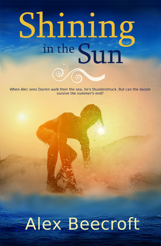
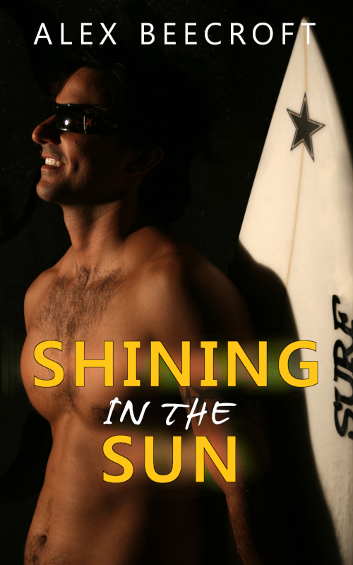
But goddammit, I am trying to make a living here, so I’m going to take the hit and hammer that genre button for all I’m worth. Which means that these books now look like this:

On the plus side, sometimes you can spend days trawling through stock-photo sites looking for the perfect picture, but that picture of Kjartan, which genuinely looks like him fell into my hands in less than an hour. How often is it that you can go looking for a white-haired elf prince and actually find a good photo? Vanishingly rare. It must be an omen.
I think I’m going to keep a cover-art graveyard on this site. I surely can’t be the only one who finds the constant evolution of images interesting.
Also I think some of them might make good posters.
Mirrored from Alex Beecroft - Author of Gay Romance.
no subject
Date: 2018-12-14 01:04 pm (UTC)no subject
Date: 2018-12-14 02:49 pm (UTC)no subject
Date: 2018-12-14 02:44 pm (UTC)Fantasy romance is an especially tough cover-art challenge; my sympathies. As for the surfer cover, I agree that the first version doesn't convey the genre.
I can't help but wonder, though, whether you might able to find covers that are genre-appropriate yet are of high aesthetic quality.
no subject
Date: 2018-12-14 02:59 pm (UTC)But yeah. I blinked for about six months and suddenly the cover art in the m/m genre is very different from what it was the last time I looked. That's part of why I felt the need to update.
I don't feel too bad about these because (a) he looks just like Kjartan!!! and (b) being a surfer is actually a perfectly good reason for not wearing a shirt :) (Also SitS is on the hotter end of my spectrum of writing, so it can probably live up to it.)
no subject
Date: 2018-12-14 04:29 pm (UTC)How interesting that single-guy covers are becoming more common! That certainly makes cover-art purchases easier.
Now I just have to figure out where to find photos of POC in 19th-century clothing. . . .
no subject
Date: 2018-12-16 02:48 pm (UTC)Anyone in period clothing is really hard, but PoC even more so. I tend to search on re-enactors, or failing that go for a close-up headshot that does away with the need for clothes at all.
no subject
Date: 2018-12-18 11:48 am (UTC)The number of hours I have spent in my life on cover-art searches . . .
no subject
Date: 2018-12-18 12:10 pm (UTC)no subject
Date: 2018-12-15 11:13 am (UTC)The original cover would not make me buy it if I was scrolling through books looking for a romance novel.
(I got it because I was in the mood for an Alex Beecroft book)
The second one is even more true. I'd never have guessed romance from the cover - I'd have assumed it was in the wrong section.
Incidentally, I haven't read 'Shining in the Sun' but the cover image would make me assume it was more porn than romance. It's the background colour that does it.
I find when I'm looking round in charity shops, I can spot romance novels just by the colour of the cover.
no subject
Date: 2018-12-16 02:52 pm (UTC)Hm, SitS isn't porn, but it does have at least a couple of sex scenes in it - it's from before the point where I went all fade-to-black. I'll keep an eye on the reviews to see if I'm disappointing anyone, and if I am, I'll change it then. It was just the most dramatic picture of a surfer that I found, and really easy in terms of where to put the text on :)
no subject
Date: 2018-12-22 07:46 pm (UTC)no subject
Date: 2018-12-27 10:36 am (UTC)So much to keep track of! How are you doing these days?
no subject
Date: 2018-12-27 01:36 pm (UTC)Not been in great shape for a while -- I've had severe chronic migraine for the last year, bad enough to have been off work for three months and even now having to ration my not-work time on the computer. I'm using my Christmas break to catch up on various not quite as urgent jobs. Alas, self-publishing my Loose Id books is still well down the To Do list. And it turns out treeware still has its uses - "no, I think I will not get rid of the paperback Georgette Heyers I now also have in ebook after all". :-)
no subject
Date: 2018-12-31 11:21 pm (UTC)I hope 2019 is better for you!