alex_beecroft: A blue octopus in an armchair, reading a book (Default)

Did I say I’m sprucing up my backlist? I feel sure you must have noticed that by now šŸ™‚

This week I’ve been improving the books’ description pages on Amazon and flexing what I’ve learned about writing better blurbs.

But one of the other things I’ve learned since really getting into the self-publishing mindset is that when people want a book of one genre and they see a book with a cover that looks like it belongs to a different genre, they don’t go “oh, how unique and interesting!” They go, “That doesn’t look like the type of book I want. I’ll give it a pass.”

Which means that if your cover is too ‘unique and interesting’ you’re actually putting readers off. What you need is cover art that looks similar to all the other covers in your genre, so that readers are reassured that they are indeed buying something that they want.

It really grieved me to have to replace these two covers, because I was so pleased with them both when I first made them. And I still look at them with pleasure. They are nice book covers – for a Fantasy and for some kind of literary fiction about the surfer lifestyle.

Ā 

But goddammit, I am trying to make a living here, so I’m going to take the hit and hammer that genre button for all I’m worth. Which means that these books now look like this:

Ā 

On the plus side, sometimes you can spend days trawling through stock-photo sites looking for the perfect picture, but that picture of Kjartan, which genuinely looks like him fell into my hands in less than an hour. How often is it that you can go looking for a white-haired elf prince and actually find a good photo? Vanishingly rare. It must be an omen.

I think I’m going to keep a cover-art graveyard on this site. I surely can’t be the only one who finds the constant evolution of images interesting.

Also I think some of them might make good posters.

Mirrored from Alex Beecroft - Author of Gay Romance.

alex_beecroft: A blue octopus in an armchair, reading a book (Default)

With Samhain closing its doors, hundreds of authors are now wondering what to do with their backlists. I’ve been busily making mock-ups for new cover art for my own books, and I thought this might be a good time to repost this “Absolute basics of making your own cover art” post. Learning how to use a photoshop-type program like Gimp takes a long time and a lot of effort, so if you’re reasonably well off but short on time, I think your best option is probably to buy your Samhain covers, or pay a professional to make new ones. If you’re short on money but long on time, however, this might be the point to teach yourself how to make book covers.

First of all, go to http://www.gimp.org/ and download The GIMP. (This stands for ā€œGNU Image Manipulation Programā€ and has nothing to do with leatherwear unless you want it to.) The Gimp is almost as powerful as Photoshop, more than capable of allowing you to make highly professional book covers, yet totally free.

It’s also offputtingly complicated and has no user manual, but who cares about that, right? šŸ™‚

So, today let’s make a cover for a book which you are going to upload to Smashwords. Smashwords likes its book covers to be 2400 pixels tall by 1600 pixels wide. If you want to make a cover for Amazon, you’ll need to check what dimensions they recommend and use those instead.

Read the rest of this entry » )

Mirrored from Alex Beecroft - Author of Gay Historical and Fantasy Fiction.

alex_beecroft: A blue octopus in an armchair, reading a book (Default)

To say I’m pleased with this one would be an understatement. Particularly as I know how hard the artist worked to get something that was in-period, when I kept sending the mockups back. “It’s lovely, but they didn’t wear plate armour in those days.” “I love it, but I’m sorry, we can’t have a castle because they didn’t build them yet.” “It’s gorgeous, but the heater-shield didn’t come in until the 13th Century and has to go.”

I felt like a real diva. All the more so because I know exactly how hard it is to get stockphotos which are right for any historical period. I was trying not to nitpick, but on the other hand, I also knew that anyone who knew anything about the 8th Century would look at that shield and immediately think “Whoa, 500 years out of date, I bet that author doesn’t know what they’re talking about. Either that or they have no respect for their history/readers/own work.” So I just couldn’t let it go.

However, they put up with me. They changed the shield, they changed the helmet to make it look more like a spectacle helm, and eala! I am overjoyed.

ReluctantBerserker-The300

All the kudos and praise to the artist, Kanaxa :)


Mirrored from Alex Beecroft - Author of Gay Historical and Fantasy Fiction.

alex_beecroft: A blue octopus in an armchair, reading a book (Default)

On the one hand, conceptually it’s not earthshatteringly new. There must be millions of two-blokes above scene covers out there. On the other hand, I still really like it.

TooManyFairyPrinces600

Happily, I couldn’t quite get the word count on this one above 60,001 words without making a deliberate decision to pad it. So I left it at 59, 223 words. Samhain’s policy on length is to price anything above 60,001 words at $5.99 and those things which don’t quite make the length at $4.99. Which means that this one’s a bargain length for the price :) (Or a bargain price for the length? Something like that.)

Must go and update my website and sidebars :)


Mirrored from Alex Beecroft - Author of Gay Historical and Fantasy Fiction.

alex_beecroft: A blue octopus in an armchair, reading a book (Default)

One of the advantages (or disadvantages? I’m not sure,) of self-publishing is the ability to continue to mess with a book even once it’s been published. At any rate, The Witch’s Boy continues to sell, slowly but steadily, on Amazon and on Smashwords, and I continue to be happy with my decision to go for self-publishing rather than small press publishing there.

However, I read this article yesterday, which suggests ways to kickstart a bit of new life into a novel. The Witch’s Boy has any number of five star reviews, so that part is OK and I couldn’t do anything about it even if it wasn’t. The price is right already – I’m certainly not going any lower than this for an opus this size. So I thought I would try altering the cover and see if that made a difference.

I was glad to have the excuse, to be honest. While I love the Grimoire cover, it’s not what you would call eye-catching, and it is possibly a little grim. And the previous cover I’d made for it was made in days when I didn’t have much cover art experience. I now think it was a bit amateurish. I was sure I could do better.

So here’s the new cover:

witchsboycampfire500

Many thanks to Ruth Sims for the pull quote!

If you have the old version, and would prefer one with the new cover, I believe both Smashwords and Amazon allow you to download it again for no extra cost. Watch this space to find out if it makes things better or worse (or no different) in terms of sales :)


Mirrored from Alex Beecroft - Author of Gay Historical and Fantasy Fiction.

alex_beecroft: A blue octopus in an armchair, reading a book (Default)

I’ve been reading a lot of indie books recently, and noticed that most of them had covers only their authors could have loved. This prompted me to see if I could find a way of making some cheap cover art for smashwords – so cheap it was available to anyone, no matter their budget. And that prompted me to open a shop on Etsy.

What do you think?

iusb_760x100.11351463_hahq

http://www.etsy.com/shop/CoverArtforAll

An eyesore or a boon for mankind? It’s your call ;)


Mirrored from Alex Beecroft - Author of Gay Historical and Fantasy Fiction.

alex_beecroft: A blue octopus in an armchair, reading a book (Default)

So, Too Many Fairy Princes is finished, and I love it. It’s one of the few things I’ve written to which I would quite like to do a sequel. (Maybe where Drake keeps killing people and our heroes get caught up in the police investigation.) But it has no sex scene in it. It has a love story, an awful lot of UST, quite a bit of kissing, and a fade to black ending, but no sex.

I’m torn. I’m sure it would be more widely acceptable to publishers and readers alike if it had a final sex scene, but I don’t want to write one, and I don’t really think it needs one. In fact, as it’s pitched – mood wise – around the level of a Dr. Who story, I think it’s almost suitable to be classed as Young Adult, and a final sex scene would be out of keeping with the rest of it.

Rather than angst about this, I guess the thing to do is to ask my agent for her advice. Can a writer get away with fade to black romance, these days? What do you think?

Other excellent news – the cover art I did for Erastes’ Junction X is a finalist in this year’s Rainbow Awards

I’m gobsmacked by how high the standard for covers has become in the last few years. I started making them at a time when cover art was pretty dire, because I thought ā€˜I can do better than this.’ But now I’m thinking of hanging up my Gimp (yes, I know, don’t say it) for good, because I don’t think I can keep up with this rapid advance of excellence.

Right. UK Meet is coming up this weekend. I suppose I should go and write my talk!


Mirrored from Alex Beecroft - Author of Gay Historical and Fantasy Fiction.

alex_beecroft: A blue octopus in an armchair, reading a book (Default)

With the self publishing boom showing no sign of going away, I thought it might be a useful thing to do a tutorial on the making of simple book cover art. Like everything, making cover art can be as easy or as hard as you choose to make it, and while getting a professional cover artist in may be the ideal, paying for professional cover art may not be possible. If that’s the case, you can still do a pretty good job yourself with some free programmes and a tenner or so spent at the stock photo sites.

First of all, go to http://www.gimp.org/ and download The GIMP. (This stands for ā€œGNU Image Manipulation Programā€ and has nothing to do with leatherwear unless you want it to.) The Gimp is almost as powerful as Photoshop, more than capable of allowing you to make highly professional book covers, yet totally free.

It’s also offputtingly complicated and has no user manual, but who cares about that, right? :)

So, today let’s make a cover for a book which you are going to upload to Smashwords. Smashwords likes its book covers to be 800 pixels tall by 500 pixels wide. If you want to make a cover for Amazon, you’ll need to check what dimensions they recommend and use those instead.

Read the rest of this entry » )

Mirrored from Alex Beecroft - Author of Gay Historical and Fantasy Fiction.

alex_beecroft: A blue octopus in an armchair, reading a book (Default)

A DIY guide.

I decided on Monday that I would talk about this. On Tuesday Chuck Wendig, freelance penmonkey, posted 25 Things Authors should know about finding their voice on his blog, at which point I threw my hands in the air and went ā€œOh, fine, I won’t write a blog post then!ā€

(Because, let’s be honest, I am outclassed in every way, and that’s not a competition I want to get into.)

However, I read the post and then I read it again, and while it says many useful and entertaining things about finding your voice – many things which if you’re at all interested, you should go and read now – it didn’t quite say the one thing I was going to say. So I’m going to say the one thing anyway. Possibly in a slightly smaller voice than I might have done if I’d got in first. But then if I had got in first, I would be even more embarrassed and without the chance to say so.

Polite British self depreciating introduction over with, here’s what I was thinking recently about finding your style as an author. It’s couched in the form of a ramble about cover art, but there is a point in there somewhere, like a pin left behind in a tailored suit – useful if you can get it out, but a nagging worry if you can’t.

I started making cover art a while ago. It’s nice to have something that engages parts of your brain that writing cannot reach. When I set out to make my first cover, I had no idea what my style would be. I would have said it was a bit pretentious of me to hope to have a style at all. All I wanted to do was to put some pictures together in a way that would result in the sort of cover I could imagine on a book.

So I got some photos I liked and fiddled with them until they looked OK together, and paged through fonts until I found some I thought looked nice, and I made my first cover. I didn’t worry about style. I didn’t say ā€œwhat’s going to be my signature move? What’s going to be the thing that identifies this as a cover by me, as opposed to someone else? What’s my cover artist’s voice?ā€

I didn’t say that because I was too busy trying to get the damn thing to work in a way that was possible and looked good to me, given all the stuff I wanted to include.

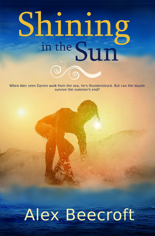
Rinse and repeat with several more covers, and I began to notice something interesting. I loved and admired covers with subtle colour in misty, soft-focus. I loved complicated covers with big design elements superimposed over textural brushes so the picture looked aged and painted-over and intricate. In short, I loved covers like this:

CaptainsSurrender300 or this UnderTheHill-Dogfighters300-2

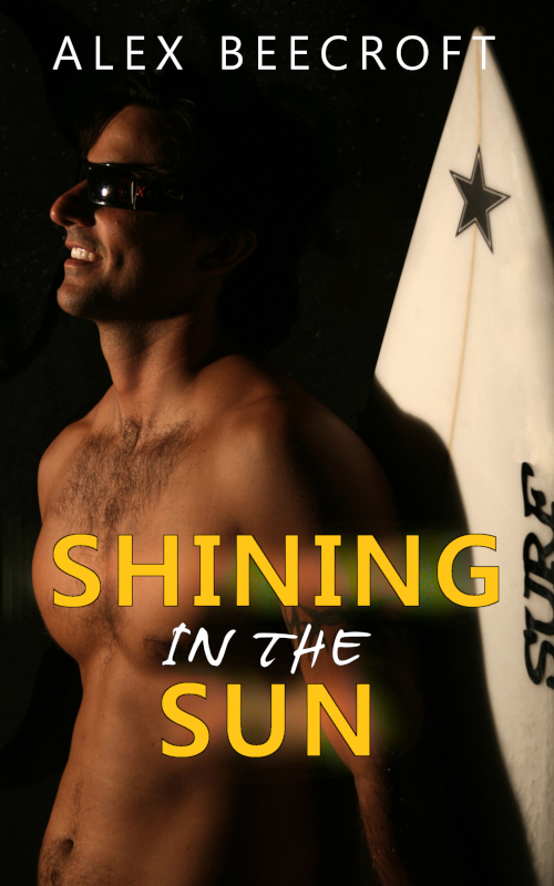
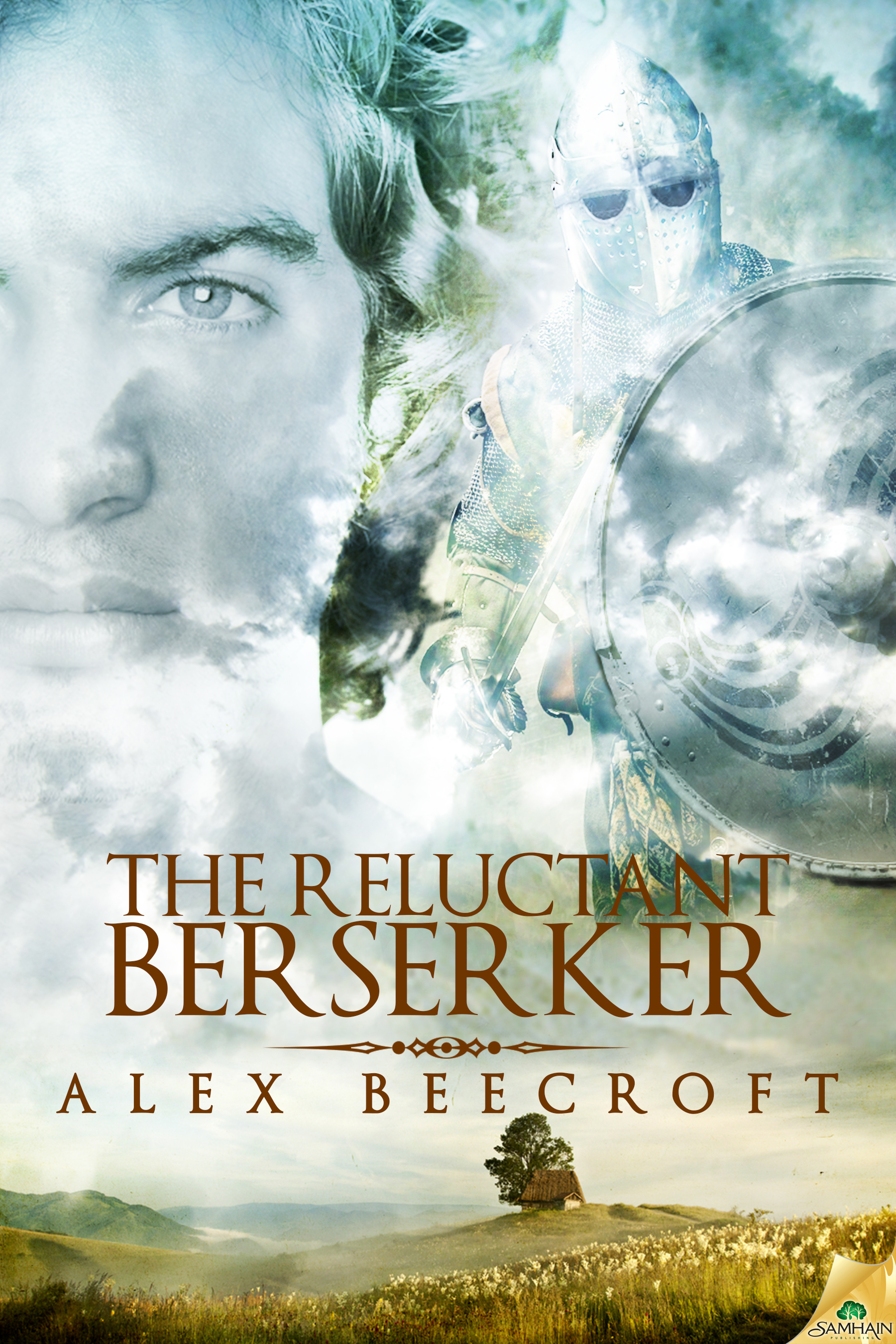
But when I made cover art myself I consistently went for as few design elements as possible, choosing to make them as bold as I could. I went for hard-edged lines, sharp focus, strong colours, clarity and simplicity. This sort of thing:

wingmentry2 or this charlielargebw

and it dawned on me that without giving it a thought, I had achieved a recognisable style of my own. It’s peculiar and a little ironic that my style in no way resembles the things that I like. It’s odd that my own style came as a surprise to me. But it’s amazing and rather gratifying to find that I have one, and it came as a free gift with the process of just getting on with it.

Which is my conclusion, really. Don’t worry about finding your authorial voice. Just tell your stories in the only way you can get them to work, given the stuff you’ve chosen to put in them. Tell them in a way that pleases you, without worrying that other authors – even the ones that you love – do it differently. Do it your way, because you are you, so doing it your way is the only way for you to be authentic. Then, when you’ve done it for five books or so, your author’s voice will jump out and laugh at you and say ā€œStupid! You’ve had a voice all along. You write like this!ā€ And it may be an odd surprise, but it should be a pleasant one, if only because it didn’t ever need to be a big deal.

Mirrored from Alex Beecroft - Author of Gay Historical and Fantasy Fiction.

alex_beecroft: A blue octopus in an armchair, reading a book (Default)

Gosh, my titles are imaginative, aren’t they? But I got the final version of my cover art for Under the Hill: Dogfighters last night and had logged on to post it for people to see, when I came across the Hobbit trailer. That made two things to squee about instead of just one, so here they both are together, unconnected except by my enthusiasm.

UnderTheHill-Dogfighters300-2

Look! I have a dragon! And a Mosquito bomber, and mehndi, and countryside that looks like it really is the Peak District, and a model I can easily picture as Ben – he has just the perfect attitude. So cool! I can’t wait to get both this and Bomber’s Moon in paperback. They’re going to be such handsome books :)

~

As for the Hobbit trailer


I’m loving all of it except for the completely random Galadriel/Gandalf shipping. What?! As someone who spent three years writing Celeborn/Galadriel fanfic, my feathers are mightily ruffled. Why must everyone in the world disregard my favourite elf?

Apart from that, I loved the Dwarvish plainsong, and I particularly love ā€œCan you promise that I will come back?ā€ ā€œNo.ā€

So, on the whole I’m guessing it’ll be like the other films – mostly excellent, but with some bits inserted that make me tear my hair out. I wonder which part will outweigh which.

Mirrored from Alex Beecroft - Author of Gay Historical and Fantasy Fiction.

alex_beecroft: A blue octopus in an armchair, reading a book (Default)

As November draws to a close, and all over the internet come the cries of NaNoWriMo participants reaching their 50K goal for the month, I have achieved my In2.5NoEdMo.

My individual month of editing two and a half books – if a novella counts as a half book – turned out to be almost as strenuous as the writing challenge. But I finished it on Friday, had a weekend, and started work on my WIP again today with a grand total of 1051 words. The plan had been to finish this WIP during NaNo, but you know what they say about the plans of mice and men.

Most of my work time today was spent reading what I had already written, so that I could pick up the tone and characters from where I put them down, and I’m pleased to say that I definitely enjoyed what I have so far – this gives me hope for the rest of it.

I doubt it will be finished this year, now. December is not a great month for buckling down to anything other than Christmas. But we’ll have to see. I might be able to get the rough draft done by the end of January, God willing, if I work hard and nobody else gets ill.

Oh, oh, and I have seen the mockup of the cover art for UtH: Dogfighters and it’s even better than the cover art for UtH: Bomber’s Moon. Probably my favourite cover ever, in fact. I can’t wait to show everyone :)

Mirrored from Alex Beecroft.

alex_beecroft: A blue octopus in an armchair, reading a book (Default)

When I get ill, I have a tendency towards melodrama. The truth is that I have a tendency towards melodrama at all times, but when I’m ill it manifests itself in the purest form – in weeping and loud declarations that I can’t bear it any more and I want to die. My life is over, I will never again be well enough to achieve anything. I might as well just give up now and allow myself to gorge on chocolate and sleep.

The sleep part is problematic because long periods of having no time alone (such as weeks in which at least one member of my family is at home all day long because of illness) give me stress, and stress gives me insomnia. So I spent a large part of last night on the sofa unable to sleep because of the ticking of the clock, while unable to sleep in my bed because my husband was breathing. How unreasonable is that?!

The chocolate part is problematic because I’ve been on a low fat diet for over a year, and I know that if I once let it slip I could pile the three stone lost back on in as many weeks. I’m only at the ā€˜I resent the fact that I can’t have chocolate’ stage as yet. I’ll have to be much more wrecked before I actually give in and eat.

So my righteous misery has been gathering speed for so long, deprived of my normal sources of comfort, that I was quite unprepared for it to be interrupted by cover art. But lo! Cover art I have, and it is good ;)

In fact I think it may be my favourite cover art ever. The guy looks like Chris! The stone circle is stone-circley! The Lancaster is a Lancaster! And the over-all colour scheme is lovely. I like the text, I like having a single character rather than a pair on there. I like the fact that he’s got clothes on – I like everything :)

I was quite on course for a well deserved tantrum today, but now I think I’ll just look at my cover art again and chill. Life is possibly worth living after all.

UnderTheHill-BombersMoon72lg

Mirrored from Alex Beecroft.

alex_beecroft: A blue octopus in an armchair, reading a book (Default)

Maybe it’s a case of ‘separated by a common language’ again, but how hard can it be to find a single decent picture of an Oxbridge young man in summer flannels (preferably lounging against a wall)?

I’m looking for something like this:

brideshead460

And I’ve tried Brideshead Revisited (as a sort of theme), Maurice (theme), EM Forster, Oxbridge punting, Oxbridge boating, 1930s style, flannel trousers, garden party, Ascot, Edwardian gentlemen, elegant men, themed weddings and even three men in a boat. And I’m getting pictures of gardens, ties, men in business suits and high tech yachts. Searching for ‘men in punts’ just gets me a do you mean ‘men in pants’?

So maybe I’m using the wrong terms. Anyone got any suggestions?

.

Profile

alex_beecroft: A blue octopus in an armchair, reading a book (Default)
alex_beecroft

March 2020

S M T W T F S
1234567
891011121314
15161718192021
22232425262728
293031    

Syndicate

RSS Atom

Most Popular Tags

Style Credit

Expand Cut Tags

No cut tags
Page generated May. 24th, 2025 08:31 pm
Powered by Dreamwidth Studios